

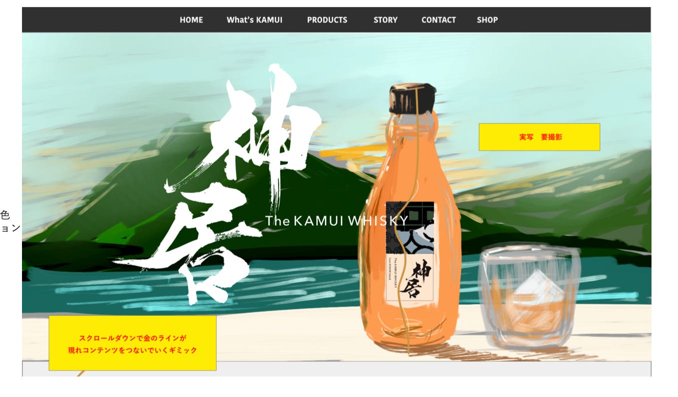
Our First Label
Our First Label
Kintsugi - For those of you who don’t own a broken vase, lovingly stitched back together with gold joinery, let me explain why we find it so beautiful.

Hey, I’m Casey. Welcome to our weekly newsletter, sharing the startup journey of Kamui Whisky K.K.. Each week the team or I will share a story as we set up a craft whisky distillery on a remote, volcanic island in the northernmost part of Japan.
Between looking at catalogues of boilers, assessing the specs of pump systems, and double-checking the pivot tables in our business plan, I’ve been able to partake in a bit of marketing fun.
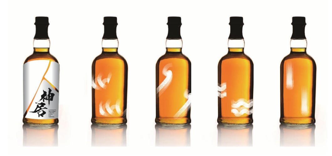
This week we had delivery of the 2nd round of designs for our label.
Today, I’ll share the latest ideas from our design team: Tomohiro Hama, Creative Director; Chikako Hashimoto, Art Director; and Momoko Abe, Art Director.
This is iterative so please do add your comments down below or reply to the newsletter and let us know what you like.
The Design Remit
The guidelines for the design team were three:
A distinctive label that will pop with originality on busy liquor store shelves
Imperfect beauty, using the idea of Kintsugi
Inspired by Rishiri, not typical Japanese motifs
Kintsugi
For those of you who don’t own a broken vase, lovingly stitched back together with gold joinery, let me explain why we want to include it into the label and bottle design of Kamui Whisky K.K.
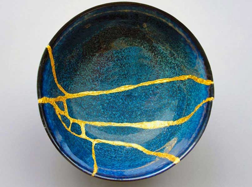
First, it is beautiful. Secondly, it’s deep.
Taking something broken, and rather than throwing it away, or trying to cover up and minimize its flaws, a ceramic is pieced back together with gold, its cracks fully visible. The “new” piece is now more beautiful than the original. It certainly has more depth. Like the person with a face of a model, but with a nose that was broken and not set correctly, it has more character, that makes it so much more interesting.
We view our presence in the whisky world somewhat similarly. We do not come from a traditional whisky background. We did not complete long apprenticeships, nor learned all the traditions over many years. We respect all that, and have studied, but we are primarily bringing a lot of new ideas, an adventurous, innovative spirit to an established craft. Many of our ideas could be see as “broken” to more traditional eyes.
I’ve already been on the uncomfortable, receiving end, of having our ideas scoffed at. I’m sure I’ll be in that position several times again in the future. But it’s okay. We are coming in with a Beginner’s Mind. Nothing, other than the basic fundamental of using just 3 ingredients, is sacrosanct for us. We want to make a whisky that is lovingly crafted, but one that was thought about, and experimented with, for every part of the process.
Kintsugi art represents this spirt. I hope it will signal, from the bottle and label, the unique beauty of our Rishiri Distillery.
Idea 1 - Peel off Label
This one came from Art Director Abe-san’s creative mind. The Kintsugi isn’t melted on with gold, rather the Kintsugi comes from the negative space, where the label is transparent and the golden whisky is visible beneath.
Underneath, there are different designs painted on the bottle representing the elements that made the whisky. We imagined to have artist collaborations using some of the open white area on the label, or for the daring artist to have that underneath, only seeable when you peel off the label.
Discussing the idea, in a psychologically safe way, we thought we’ll try to refine it further by changing the label to washi, which has more texture, as a peel off feels a bit ‘mottanai’, as well as having the black logo replaced with our traditional orange.
Idea 2 - Kintsugi Down the Bottle
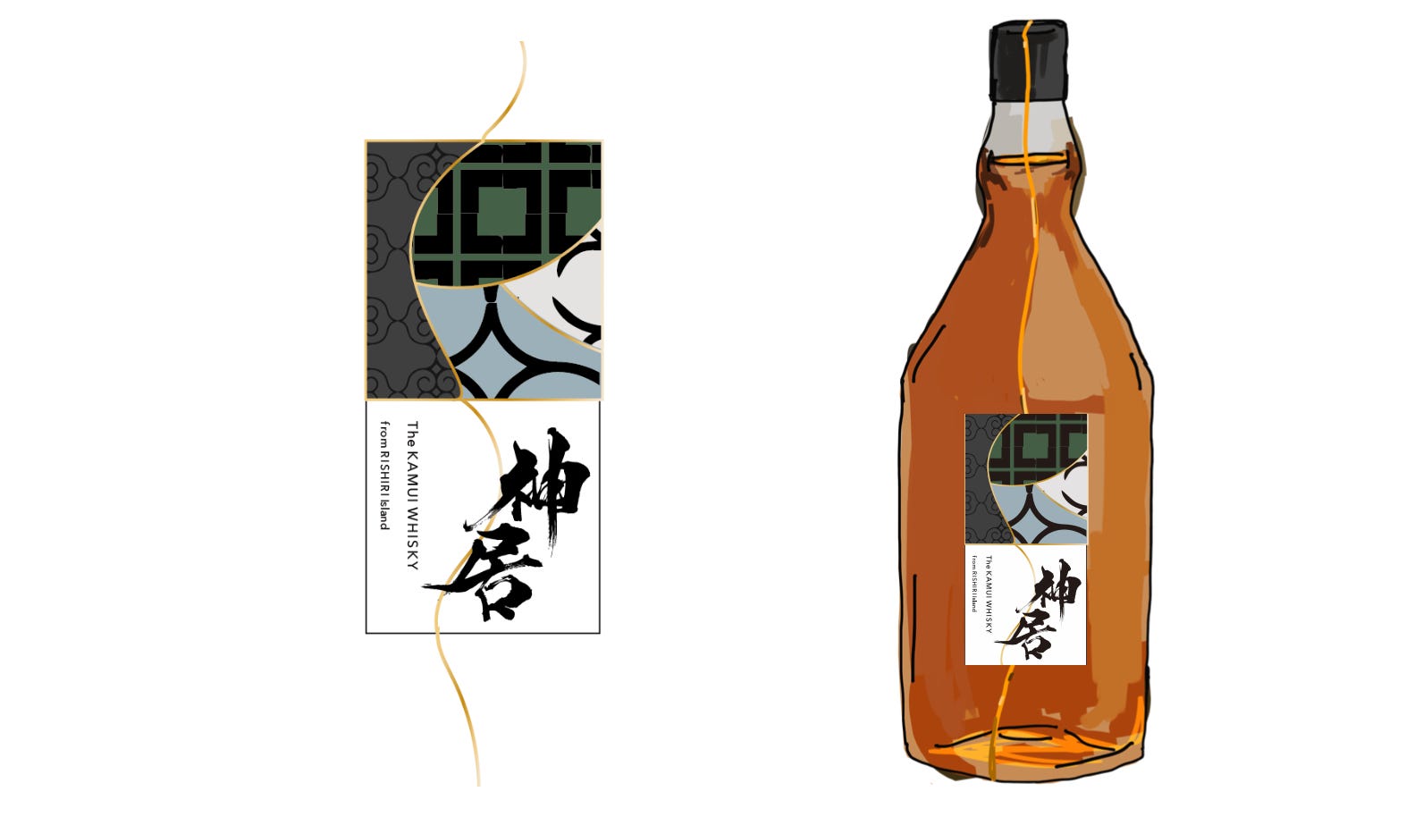
Art Director Hashimoto-san came up with these ideas that we’ve been exploring since the first delivery.
I really dig the gold thread going from the top of the bottle cap down through the label all the way to the bottom of the bottle. That is unique, and, I think, would really jump out, whether on a busy shelf, or when at home admiring it.
The design has some Ainu, indigenious people of Hokkaido, motifs. The thought being Kamui is originally an Ainu word. Interesting, but as none of us are from Ainu decent it would be a line of appropriation we shouldn’t cross. Kamui is the original name of our land, so we should be safe there.

This one has the outline of Rishiri in the label. Also pretty cool, especially when subtly placed up at the top of the label with the Kintsugi running through it.
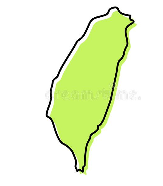
I was worried it would feel a bit too gimmicky, maybe get a bit confused with the shape of Taiwan, which you tend to see on labels here and there in this part of the world.
What do you think?
This style looked quite cool for the website, which we are also thinking of redesigning to bring in tighter brand alignment. It feels very warm, particularly the hand-sketched nature of it.
Hashimoto-san also had another design:
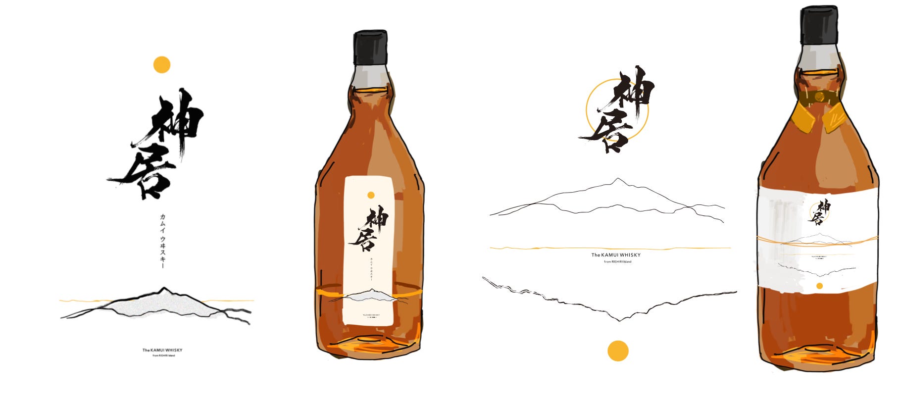
Clean, minimal, but with depth and meaning.
Idea 3 - The Square Bottle
This was the US team’s favourite from the first round.
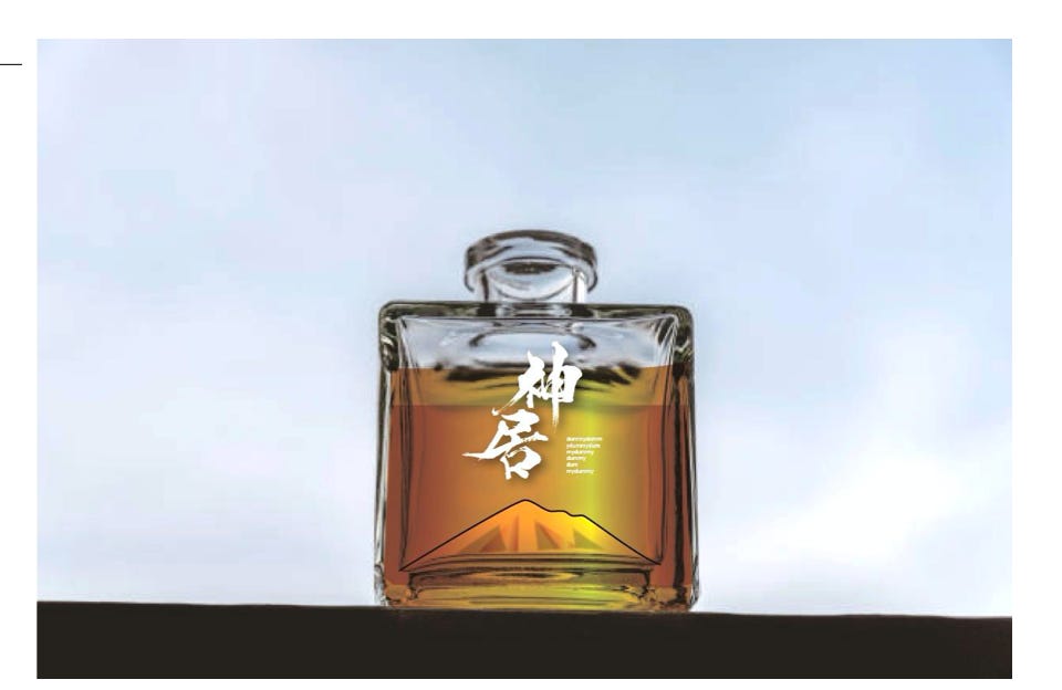
The shape is distinct compared with most whisky bottles. The idea was to have the bottle be a piece of artwork itself, with Mt. Rishiri-Fuji molded (blown?) into the bottom.
The US team, wisely, went out and did some field research, and while they really liked the design, they realized it could get lost on shelves.
We’re thinking to hold the square bottle design in reserve, maybe use it for a special, limited edition bottling rather than our main whisky series.
How to Decide?
The design team will explore each of the above concepts further. When the next revisions are ready, we will have sample labels printed so we can see and feel the texture, to better experience it. We’ll take those and do some field testing here in Japan- we’ll put them up liquor store shelves, while someone distracts the clerk (or hopefully gets their acquiescence), and see how well it pops.
We don’t have a set decision-making process for choosing the design. Likely, it will be by made by feeling of the founders. But, everyone on our team gets a voice. We’d love to hear yours too. Please do share in the comments or hit reply.
Hi Casey & team! Really enjoying that you let us follow the whole story here! Knowing a bit about the logistic and labor challenges of labeling at scale may skew my opinion a bit, but disregarding the "how" for a moment I really like the first idea of using the whisky as the gold part! Of the more traditional and practical ideas the gold line as the horizon with Rishiri outlined as a silhouette on the label is quite appealing. Best of luck and looking forward to eventually visiting the distillery! -Mikael